Learn how to choose color palettes that actually work. From mood to proportion, this guide helps you style your space with confidence—no guesswork, no stress.
Why Color Changes Everything
Color isn’t just decoration—it’s emotion. It sets the tone. It shifts the mood. It makes a room feel calm, energetic, cozy, or fresh.
But choosing the right palette? That’s where most people freeze. Too many options. Too many rules. Too much pressure to “get it right.”
Here’s the truth: you don’t need a degree in design. You just need a few smart steps—and a little trust in your gut. Creating a Feature Wall with Paint or Wallpaper
Step 1: Start with What You Love
Forget trends. Forget what’s “in.” Start with colors you’re naturally drawn to—the ones that make you feel good. 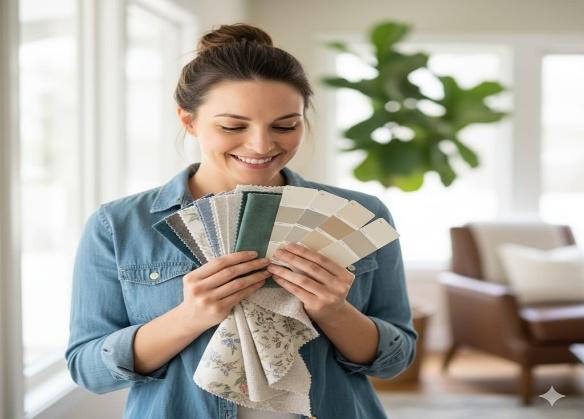
- Look at your wardrobe, favorite art, or even your phone background.
- Pull inspiration from nature, travel, or memories.
- Don’t worry if it’s bold or subtle—if it feels right, it’s a good starting point.
Human moment: One reader started with the blue in her grandma’s teacup. That shade ended up on her kitchen walls, her curtains, and even her mugs.
Step 2: Consider the Room’s Mood and Function 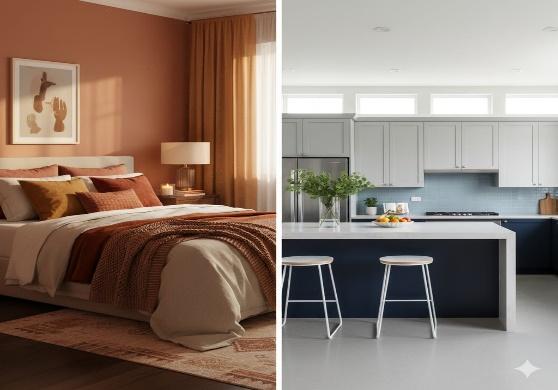
Every room has a job—and the colors should support it.
- Bedrooms: Go soft and calming—think warm neutrals, dusty blues, or muted greens.
- Kitchens: Fresh and energizing—whites, light woods, or pops of citrus.
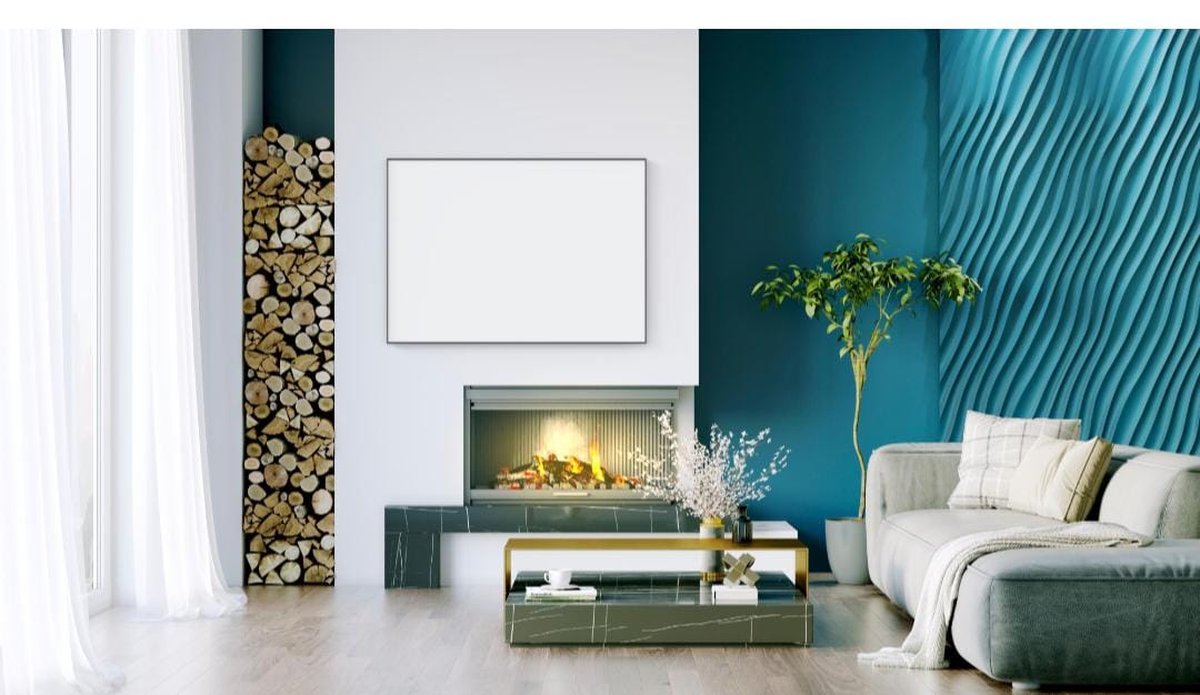
- Living rooms: Depends on your vibe. Cozy? Try deep tones. Airy? Stick to light layers.
Styling tip: Ask yourself how you want to feel in the space. That answer will guide your palette better than any color wheel. DIY Window Treatments: Curtains & Blinds
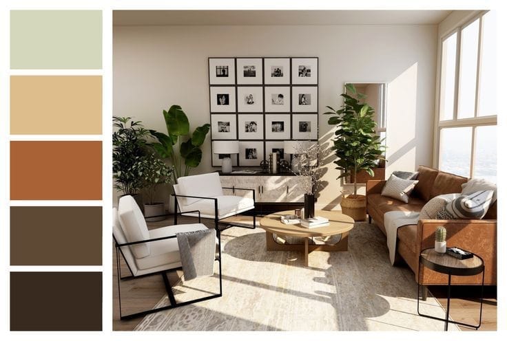
Step 3: Use the 60-30-10 Rule
This classic design rule keeps things balanced—even if you’re mixing bold colors.
- 60%: Your main color—walls, large furniture, and rugs.
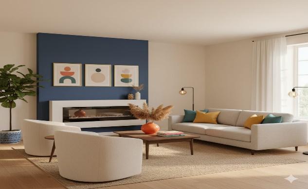
- 30%: Secondary color—curtains, accent chairs, and bedding.
- 10%: Pop color—cushions, art, vases, and small decor.
Real moment: Even if you’re using neutrals, this rule helps avoid that “flat” look. It adds rhythm without chaos
Step 4: Test Before You Commit
Colors change depending on light, time of day, and even the mood you’re in. 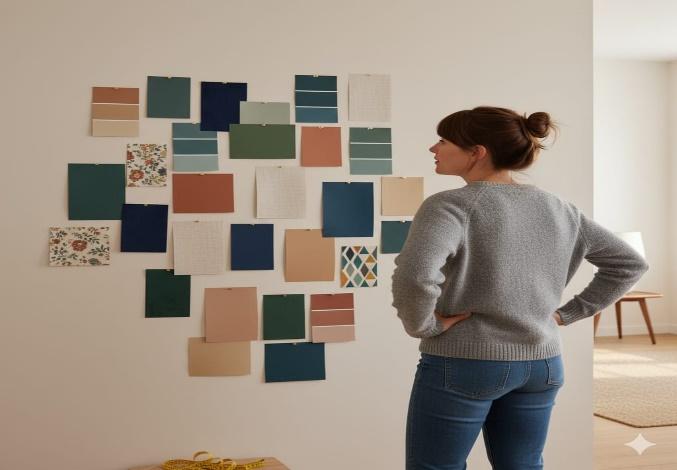
- Paint a few swatches on the wall—not just one.
- Pin up fabric samples and live with them for a few days.
- Step back. Look at them in morning light, evening light, and everything in between.
Human moment: What looked like “calm beige” in the store turned out to be “sad gray” on the wall. Always test.
Step 5: Think Beyond Paint
Color isn’t just about walls. It’s in everything—textiles, furniture, art, even plants.
- Use cushions, throws, and rugs to layer color without commitment.
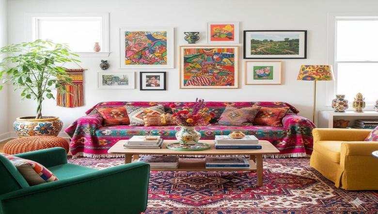
- Add artwork or books with tones that echo your palette.
- Even a vase or lamp can shift the mood.
Styling tip: If you’re renting or not ready to paint, textiles are your best friend. They’re flexible, affordable, and easy to swap. How to Hang Art Like a Designer
Bonus Tips for Confident Color Choices
Want to go a little deeper? Try these:
- Use a color wheel. It helps you spot complementary and contrasting tones.
- Stick to undertones. Warm with warm, cool with cool — mixing them can feel off.
- Limit your palette. Three to five colors max keeps things cohesive.
- Repeat colors across rooms. It creates flow and makes your home feel connected.
Budget tip: Use free online tools like Coolors or Adobe Color to build palettes from photos or favorite shades.
Final Thoughts
Choosing colors isn’t about being perfect—it’s about creating a space that feels like you.
Start with what you love. Think about how you want to feel. Test, tweak, and trust your instincts.
Because when the colors work, the whole room comes alive.