Wall art has the power to change a room in seconds. It sets mood, adds personality, and ties everything together—but only if it’s hung thoughtfully. Too high, too low, too small, too busy: placement mistakes can make beautiful art look out of place. Designers lean on a few reliable rules to make walls feel intentional, balanced, and alive. Follow these guidelines, and your art won’t just decorate a room—it will anchor it.
Step 1: Hang at eye level
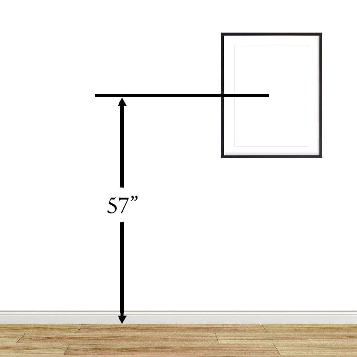
 “Eye level” is the golden rule for a reason. Artwork that’s hung too high feels disconnected from the furniture; too low and it looks heavy. In living spaces, aim for the center of the artwork to sit around the typical seated eye level so it relates to the sofa or console beneath it. In hallways or galleries where people stand, eye level should feel natural as you move through the space, not like you’re craning your neck.
For flow tips, see Rearranging Furniture for Better Flow.
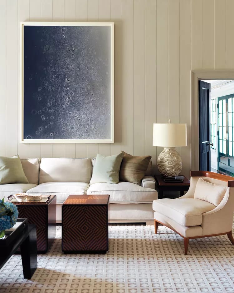
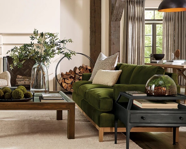
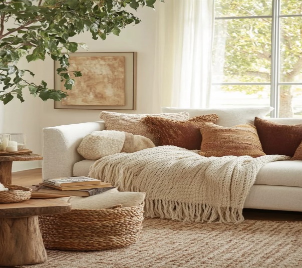
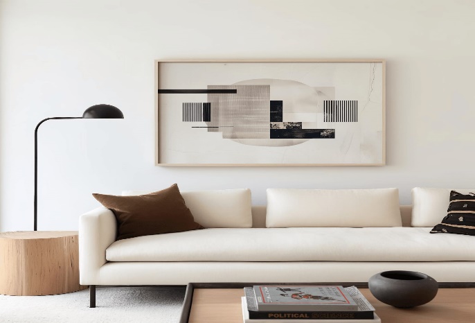 Step 2: Anchor art to furniture
Art needs a relationship with the pieces below it. Center artwork to the furniture it sits over, not to the wall as a whole. Above a sofa, the width of the art (or grouping) should feel proportional—typically spanning roughly two‑thirds of the sofa width—so the composition looks grounded and intentional.
For proportion ideas, check Small Room Design Hacks That Actually Work.
.
 Step 3: Mind the spacing
The gap between the top of the furniture and the bottom of the frame matters. Keep a comfortable visual “breathing space” so the pieces feel connected but not cramped. A tight gap looks awkward; too much space can make art float away from the vignette. Aim for a tidy, visually calm relationship that ties the wall to the furniture.
For composition guidance, see Styling Open Shelves with Purpose.
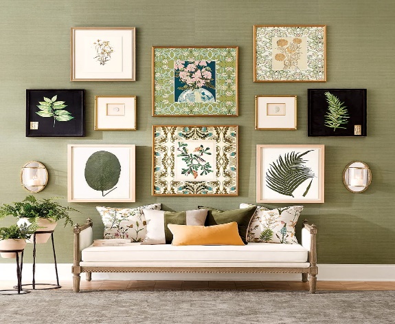
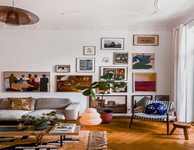 Step 4: Build balanced gallery walls
Gallery walls should feel curated, not chaotic. Pick a consistent thread—color palette, frame material, or subject matter—and keep spacing uniform between pieces. Lay the arrangement on the floor first, start from a central anchor piece, and build outward. Balance heavy visuals (large dark frames or bold art) across the whole composition, not all on one side.
For texture and pattern cohesion, check Mixing Textures and Patterns in Your Space.
 Step 5: Create a focal point, then support it
Every room benefits from one strong visual moment. Use a standout piece—large artwork, a diptych, or a sculptural wall object—as the focal point, then complement it with smaller, quieter pieces elsewhere. This keeps the eye from ping‑ponging and gives the room clarity and confidence.
For focal point strategy, see How to Create a Focal Point in Any Room.
 Step 6: Scale art to the wall
Tiny art on a big wall gets lost; oversized art on a narrow wall overwhelms. Match the scale to the available visual field. On large walls, go big or cluster multiple smaller works into a unified arrangement. On tight columns or between windows, choose elongated pieces or vertical pairs that respect the proportions.
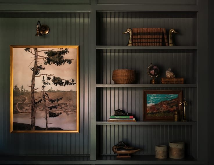 Step 7: Use lighting to elevate art
Art without light fades into the background. Layer lighting to make pieces glow: picture lights for classics, wall sconces flanking a frame, or a well‑placed floor lamp to graze texture. Avoid harsh overhead glare; aim for warm, directional illumination that brings colors and details to life.
For layering tips, check DIY Accent Lighting Ideas.
 Step 8: Match frames and mats to the mood
Frames are part of the composition. Sleek metal or thin black frames feel modern; warm wood introduces organic texture; ornate frames suit vintage or classical pieces. Mats add breathing room and elevate smaller works—a generous mat can make a modest print feel gallery‑worthy. Keep frame styles coherent within a room, even if you mix finishes.
Step 9: Let art guide open‑plan zones
In open‑plan spaces, art helps define areas. Use a strong piece to anchor the living zone, a calmer series near dining, and functional or tactile art (like woven pieces) by the workspace. Place art where it naturally meets sightlines—at the end of a corridor of view, opposite seating, or flanking a room divider—to guide movement and set mood.
For zoning strategies, see How to Zone Open-Plan Spaces Effectively.
.
 Step 10: Keep it human—curate, rotate, and breathe
Designers don’t just “place” art; they live with it. Curate pieces that mean something to you—travel prints, family photos, local art—and rotate them seasonally to keep rooms feeling alive. Leave some empty wall space so the eye can rest, then refresh a corner with a new print or swap a frame when the mood changes. Your walls should tell your story, not just follow rules.
For seasonal refresh ideas, see Seasonal Decorating Ideas for Every Room.
Final thoughts
Great wall art placement is part science, part feeling. Anchor to furniture, hang at eye level, scale with confidence, and light pieces like they matter. Then let your taste lead: mix frames thoughtfully, curate gallery walls with intent, and give your home room to breathe. When art connects to how you live—not just how a room looks—the space feels personal, grounded, and effortlessly stylish.